
Using Data Visualisation in Forensic Audit Reports for Executive Buy-In
Seeing Is Believing: Using Data Visualisation in Forensic Audit Reports for Executive Buy-In. Forensic audit findings are only as effective as their impact on decision-makers. Yet traditional reports often bury key insights under pages of technical data.
This Duja Consulting paper explores how data visualisation and storytelling transform forensic audits into compelling narratives that executives can instantly grasp — leading to faster, more confident decisions.
Highlights include:
- How visualisation enhances comprehension, credibility, and trust.
- Real-world case study: turning 600 bank statements into trial-ready evidence in 3 days.
- Best practices for charts, dashboards, and flow diagrams that make forensic data memorable.
- Practical steps to help forensic teams adopt visual reporting techniques.
When executives can see the story, they’re far more likely to believe it — and act on it.
Introduction
In today’s data-driven business environment, executives are pressed for time and inundated with information. Forensic audit reports – often dense with details of investigations, financial anomalies, and evidence – must cut through this noise to secure executive buy-in. This white paper explores how data visualisation can transform forensic audit reporting across industries to engage senior leadership better. By presenting complex findings visually, forensic teams can enhance comprehension, build trust, and facilitate decisive action among executives. We examine the shortcomings of traditional reporting and demonstrate how effective data storytelling with visual tools leads to stronger executive engagement. A real-world case study highlights the successful use of visualisation in a forensic audit, and we provide recommendations for implementing these practices within forensic teams.
Challenges in Traditional Forensic Audit Reporting
Traditional forensic audit reports are frequently lengthy, text-heavy documents that pose challenges for busy executives. Investigations often yield voluminous data and technical details, which forensic auditors dutifully document. However, this can result in reports “cluttered with data, often irrelevant to the main point”, as auditors may include numerous tables and minutiae that do not add value to the conclusions. Excessive detail buries key insights, leaving executives “buried under irrelevant facts and distracted from the larger point”. The drive for accuracy can lead to “hair-splitting” – every nuance is reported at the cost of clarity. Such reports become difficult for non-specialists to parse.
Another common issue is the structure and language of traditional reports. Often, findings are presented in a linear, academic fashion, with background and criteria described at length before the main conclusions. This can test an executive’s patience: “the reader’s patience is tested as he/she has to go through a whole lot of information before knowing what it is leading to”. Critical insights may be tucked away deep in the document instead of being highlighted up front. Long-winded sentences and technical jargon further impede readability. In one notable example, an important audit finding failed to get attention because it was buried under an “incomprehensible title” laden with technical terms. These challenges mean that even when a forensic audit uncovers significant fraud or control failures, the message might not resonate with executives if delivered in a traditional format.
Limited visual context is another shortcoming. Traditional reports rely on narrative and static tables, which may not convey patterns or scale effectively. Without visual aids, busy board members or CXOs might struggle to see the big picture in a fraud case spanning hundreds of transactions. The result can be a lack of engagement – executives may skim or misunderstand critical findings, undermining buy-in for recommended actions. In summary, conventional forensic reports, while thorough, often sacrifice executive-friendly communication. They can overwhelm readers with data, use opaque language, and hide the headline insights – all factors that lessen their impact on decision-makers.
The Power of Data Visualisation for Executive Audiences
Data visualisation offers a powerful remedy to these issues by translating complex forensic findings into clear, compelling visuals. Well-designed charts and graphics can convey insights at a glance, enabling executives to grasp the essence of an issue quickly. As one expert notes, “visualising data is essential for conveying insights quickly and clearly to senior leadership, facilitating swift decision-making.” In other words, the use of visuals respects executives’ time constraints and cognitive load. Rather than wading through pages of text, leaders can absorb key results from a dashboard or infographic in seconds.
Crucially, visualisation enhances comprehension of complex data. Research demonstrates that people process images faster than text, and forensic contexts are no exception. A recent study on audit analytics found that teams supported by data visualisation tools achieved higher accuracy and efficiency in their tasks than those without visuals. The group using visual aids not only scored better on understanding the information but also completed their analysis more quickly. This underscores how charts and graphs help stakeholders “more effectively process information”, especially in data-heavy investigations. Visual tools leverage the brain’s pattern-recognition abilities – for instance, a well-crafted graph can illuminate a trend or outlier that would be lost in a spreadsheet. Georgia Tech’s Chief Audit Executive, Phil Hurd, observed that “visual reporting allows the brain to assimilate a large quantity of information very quickly”, enabling auditors (and their audiences) to compare data sets without needing in-depth knowledge of every transaction. The result is that issues needing attention stand out immediately in a visual context. For executives, this means faster comprehension of the forensic story: whether it’s spotting an unusual spike in expenses or understanding the scope of a fraud scheme, visuals make the complex simple.
Data visualisation can also build trust and credibility with executive audiences. Clear and transparent visuals give stakeholders a direct window into the data, which can inspire confidence in the findings. Executives are more likely to trust a forensic report that presents evidence transparently – for example, an interactive chart that lets them drill down to transaction details – than one that obscures data behind jargon. Consistency in visual presentation plays a role in trust as well. According to industry analysis, providing standardised data visuals creates “a common way to understand data” and “helps teams and stakeholders trust the data.” If every investigation report from a team uses reliable, well-understood chart formats, senior leaders know they can interpret the visuals without doubt. Conversely, poor or misleading visuals can damage trust. Inaccurate or cluttered charts may confuse audiences and erode confidence in the report. For this reason, maintaining integrity and clarity in visualisations is paramount. When done right, though, visuals reinforce that the forensic team is competent and transparent, increasing executives’ faith in the findings. In short, good visualisation practices convey professionalism and reliability, which are essential for buy-in when high-stakes decisions – such as legal actions or control overhauls – hang in the balance.
Finally, effective visualisation directly supports decision-making. Executives often have to make prompt decisions on the back of forensic audits (e.g. whether to pursue legal action, tighten controls, or approve remediation budgets). Visuals accelerate this process by highlighting the decision points. A dashboard showing the extent of losses, the timeline of fraud, and the identified control gaps provides a decision-maker with actionable intelligence in one view. As one podcast on data storytelling for executives noted, visuals “facilitate swift decision-making” by clearly conveying the necessary insights. When information is presented visually and clearly, leaders can move from understanding to action with greater speed and confidence. Indeed, standardising visual formats and focusing on clarity has been shown to improve comprehension and thus lead to better decisions across the board. The visual clarity provided by a chart or map gives executives the confidence to act decisively because they can plainly see the rationale for a recommendation. In the context of a forensic audit, this might mean the difference between an executive green-lighting an in-depth investigation into a suspicious vendor or overlooking it due to opaque reporting. In summary, data visualisation turns forensic findings into an executive-ready format – one that is easy to grasp, trustworthy, and oriented towards decision points – thereby greatly increasing the likelihood of executive buy-in and prompt, informed action.
Data Storytelling and Executive Engagement
Presenting data is not just about charts and numbers – it’s about telling a story. Data storytelling combines visualisation with narrative context to guide the audience through insights, and it has proven especially effective in engaging executives. In forensic audit reports, a narrative-driven approach might involve framing the visuals in terms of the “who, what, when, where, and how” of a fraud case, so that leaders understand not only the facts but their implications. Storytelling with data helps answer the “So what?” for executives, linking the forensic findings to the bigger picture (risks, impact, recommended actions) in a cohesive way.
When forensic accountants employ storytelling techniques – for example, showing how a series of suspicious transactions over months connects to a breach of controls – they transform raw data into a compelling narrative that executives can relate to. This approach significantly boosts engagement. Rather than presenting disparate findings, the report becomes a journey: setting the scene (perhaps an unexplained revenue shortfall), introducing the characters (shell companies, falsified invoices), revealing the plot twist (discovery of the fraud pattern via data analysis), and finally, the resolution (steps taken to address the issue). Executives are more likely to stay engaged with this story format, as it resonates more deeply than an abstract data dump.
There is evidence that marrying data with narrative yields concrete improvements in executive engagement. A global study highlighted how organisations using data storytelling saw marked benefits in leadership involvement. In one case, a pharmaceutical company implemented AI-driven data storytelling in its executive communications, achieving a 47% increase in executive engagement with the content and enabling decisions to be made three times faster for strategic initiatives. The key was integrating data visuals with a narrative that provided context, turning analytics into a story that executives could quickly understand and act upon. For forensic audit reports, this means that by weaving visuals into a storyline – for example, showing how a fraud began, escalated, and was detected – executives become not just passive readers but active participants in the investigation’s story. They can see the progression of events and are more inclined to ask questions and discuss implications, which is exactly the kind of buy-in needed.
Data storytelling also focuses the executive’s attention on incentives and outcomes, which improves buy-in. By framing findings in terms of risks mitigated or value protected (e.g. “Through visual analysis, we identified a fraud scheme that saved the company £2 million in potential losses”), forensic professionals speak to what matters to leaders. It aligns the technical details of the audit with the strategic interests of the business. In addition, a narrative can be tailored to the audience – emphasising the points an executive cares about (such as reputational risk or regulatory compliance) and using visuals to underscore those points. This audience-centric storytelling makes the report far more persuasive.
In practical terms, effective data storytelling in forensic reports might involve before-and-after visuals, scenario simulations, or highlighting contrasts (normal vs. anomalous patterns) to drive a narrative. For instance, a timeline graphic could show a sudden burst of high-risk transactions coinciding with a change in an employee’s access rights – telling the story of a rogue insider’s actions. The narrative that accompanies the visual would explain the significance and recommend next steps. This approach not only keeps executives engaged but also makes the findings memorable. Instead of forgetting a page of numbers, the executive remembers the “story” of how the fraud unfolded and was caught, which reinforces the urgency or importance of acting on the recommendations.
In summary, data storytelling enriches visualisation by providing context and emotional resonance. It leads executives through the logic of the forensic investigation and its implications. By doing so, it turns passive recipients of information into engaged stakeholders who understand the narrative and are more likely to support the actions needed – whether it’s funding a remediation effort, disciplining a fraudster, or investing in better controls. Effective data storytelling with visualisations is therefore a catalyst for executive buy-in, bridging the gap between detailed forensic evidence and strategic decision-making.
Visualisation Techniques and Best Practices in Forensic Reporting
Forensic audit teams have an array of visualisation tools at their disposal. Choosing the right type of visual for the data and message is critical. Here we outline key types of visuals – charts, dashboards, and infographics/diagrams – and best practices for presenting forensic data effectively.
Charts and Graphs:
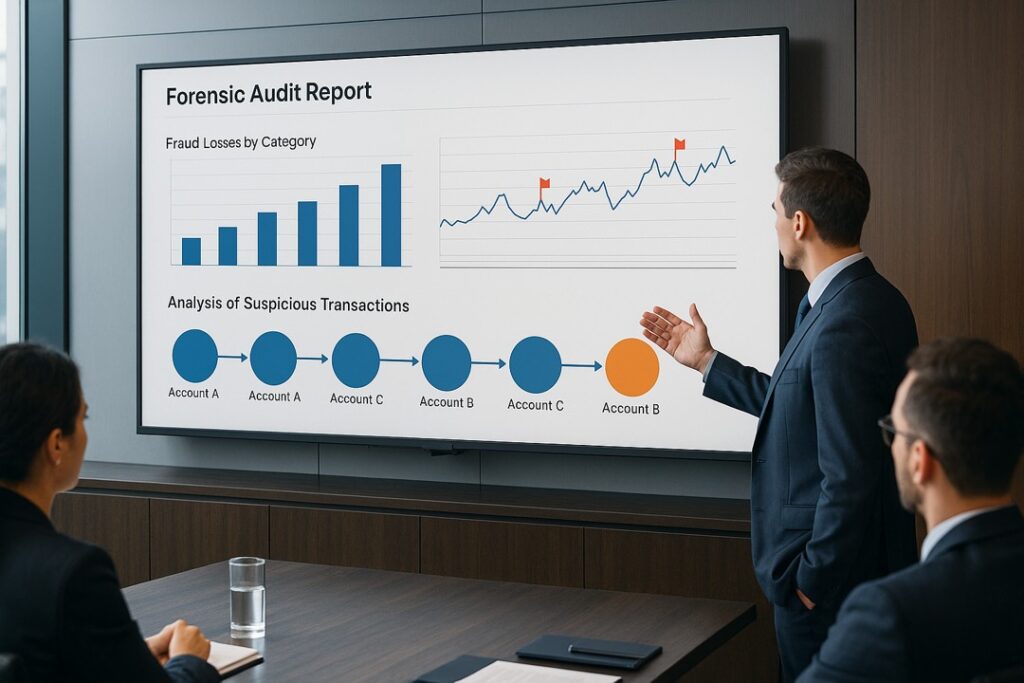
Basic charts (bar graphs, line charts, pie charts, etc.) are the building blocks of data visualisation. They distil quantitative findings into digestible visuals. In a forensic audit context, charts are ideal for highlighting patterns such as trends over time, distributions, or comparisons. For example, a line chart can show the trend of monthly expenses or cash flows, helping expose anomalies (like a sudden spike in payments in a certain month). Bar charts can compare amounts across different categories – e.g. expenditures by department, or number of policy violations by location – making it easy to spot outliers. It’s important to match the chart type to the data and insight. As a rule of thumb, use line charts for time series (e.g. revenue or transaction volume over months), bar charts for category comparisons, scatter plots for correlations, and pie charts sparingly for parts-of-a-whole (fraud types as percentage of total cases, for instance. Selecting the wrong chart can confuse the message, whereas the right chart “illuminates trends and relationships that might otherwise get buried in a spreadsheet”. Best practices for charts include keeping them clear and uncluttered – every element should serve a purpose. Labels, legends, and colour choices should be intuitive. A forensic chart should emphasise the key data (perhaps highlighting the suspicious segment in red or annotating a critical data point) without extraneous design that could distract. As visualisation experts advise, “clarity over clutter” should guide every chart: removing unnecessary elements and focusing on simplicity aids comprehension. Additionally, maintain truthful representation – starting axes at honest zeros and avoiding distortions – since credibility is paramount in an audit report. Ultimately, a good chart in a forensic report communicates a specific insight (e.g. “Vendor X’s billings doubled in Q4”) at a glance and points the executive to what needs attention.
Dashboards and Interactive Visuals:
Dashboards aggregate multiple visuals and metrics onto one screen, providing a high-level overview of an investigation or risk area. They are extremely useful for executive audiences because they present the “big picture” with the ability to drill into details on demand. In forensic auditing, a dashboard might include several components: a summary of total financial loss identified, a pie chart of fraud types (asset misappropriation, corruption, financial statement fraud, etc.), a timeline of incident occurrences, and perhaps an indicator of investigations in progress. Interactive dashboards allow executives to filter data (for example, by region or timeframe) and see the visuals update accordingly, which can answer their follow-up questions in real time. Dashboards can be designed in tools like Tableau, Power BI, or bespoke forensic analytics platforms. According to one financial investigations platform provider, dashboards and overview visuals “provide executives and case managers with high-level summaries of financial activity, highlighting areas of concern.” For instance, a dashboard might flag unusual account activity with colour-coded alerts, drawing an executive’s eye immediately to potential red flags. A best practice in designing dashboards is to follow the “five-second rule”: an executive looking at the dashboard should grasp the primary message within about five seconds. This means using clear headings, an intuitive layout (often a grid with key figures at the top), and perhaps traffic-light style indicators for status. In a success story, one company’s investigations team created a standardised dashboard to monitor global ethics cases; it included illustrative charts and even dynamic maps. This dashboard enabled the head of investigations to “quickly and easily provide updates to senior management,” including near-real-time case updates and key performance indicators, without any manual report preparation. The takeaway is that well-crafted dashboards make forensic insights continuously accessible to executives. They foster ongoing engagement: instead of waiting for a formal report, leaders can check the dashboard anytime for the latest status, which reinforces transparency and trust. As RSM, a consulting firm, notes, “clear, powerful, interactive dashboards and diagrams foster collaboration and generate insights,” turning complex investigative data into practical, understandable outputs. To implement dashboards effectively, forensic teams should focus on the most relevant metrics for their audience (e.g. number of cases, value at risk, days since last incident, etc.), ensure data is updated regularly, and provide training or a guide so that executives know how to navigate and interpret the visuals.
Timeline visualisation of transactions:
A simplified example of a “follow the money” timeline, where each row represents an account and each line indicates a transaction between accounts over time. Such timeline charts help executives and investigators see when and how funds moved, highlighting irregular activity in context. In this figure, suspicious clusters of transfers become immediately apparent, enabling quicker insight into the pattern of fraud. Chronological visuals like this allow stakeholders to intuitively grasp the sequence and frequency of events, which is especially useful in forensic cases with numerous transactions.
Infographics, Diagrams, and Visual Storytelling Aids:
Beyond charts and dashboards, forensic teams can use a variety of diagrammatic visuals to tell the story of a case. These might include timelines, flowcharts, network diagrams, or process maps – essentially, infographics that illustrate how the pieces of a fraud puzzle fit together. Timelines are valuable for showing the chronology of key events (for example, when a suspect was hired, when anomalies started, when whistle-blower tips came in, and when actions were taken). A timeline with annotated events gives executives a narrative arc of the incident. Organisational charts can be adapted to show relationships between entities or people involved in a case – e.g. linking shell companies to their beneficial owners or mapping an employee’s connections to vendors in a kickback scheme. These relationship diagrams “illustrate the parties or sequence of events” in a way that raw data cannot. One guide on forensic report writing suggests that “the use of timelines, organisational charts, and process flows may greatly enhance the audience’s ability to understand and internalise the findings.”By seeing the flow of funds or the chain of actions in a schematic format, executives can literally see how a fraud was orchestrated or how it went undetected, which often makes the findings more convincing. Another powerful tool is the flow-of-funds diagram (often implemented as a Sankey diagram or similar), which visualises how money moves through accounts. This kind of visual can immediately expose, for instance, that a large portion of funds flowed from a company account into a personal account or an offshore entity – something that would jump off the page in a diagram even if it might be hidden in a ledger. In modern forensic tools, these are sometimes interactive: one can click on an account node to see underlying transactions. The benefit of such visual storytelling aids is that they condense complexity into a coherent picture. A Sankey chart can depict hundreds of transfers in one comprehensible flow image, revealing patterns of diversion or laundering. Best practices here include focusing on clarity (e.g. clearly labelling entities and using arrows to indicate direction of funds), and layering information – start with a high-level diagram and allow drill-down or use callouts for details. These infographic-style visuals should be used to support the main findings and not clutter the report; typically, they can be placed as exhibits or appendices with callouts in the main text. By including such diagrams, forensic reports become more accessible and persuasive. They cater to visual learners on the executive team and ensure that the story of the data is understood. For example, an entity-relationship map can show at a glance that all suspicious invoices were issued by companies linked to a single individual, reinforcing the recommendation for a deeper investigation of that person. The combination of these visuals with explanatory captions bridges the gap between evidence and understanding, reinforcing executive confidence in the audit’s conclusions.
Across all these visualisation types, some overarching best practices are paramount. Ensure accuracy and integrity of visuals – they must faithfully represent the data (forensic reports often need visuals to be evidence-grade, especially if used in legal settings). Maintain consistency in style and format, which, as noted, helps build trust. Keep visuals simple and focused on the message: avoid unnecessary complexity or artistic embellishment that doesn’t serve a communicative purpose. Finally, integrate visuals with narrative: each visual should be introduced and interpreted for the executive, either via a caption or in the text, so its relevance is clear. When these practices are followed, data visualisation becomes an extremely potent tool in forensic reporting – conveying the maximum insight with optimal clarity.
Case Study: Visualisation-Driven Forensic Investigation Success
To illustrate the impact of data visualisation in practice, consider a real-world forensic investigation that leveraged visual tools to achieve executive buy-in under tight timelines. In this case, a forensic accounting team from a consulting firm was engaged in a high-stakes partnership dispute involving complex fund flows across dozens of entities. The situation was urgent: the team received the case late on a Friday with a court hearing looming on Monday. They were faced with over 600 bank statements spanning 22 legal entities and 23 bank accounts, representing four years of transactions. The mandate was to trace and reconstruct the capital flows among these interrelated entities to determine how funds had been invested and whether any financial impropriety had occurred, and to do so in only 72 hours. Traditional methods would have been hopeless: manually extracting and reconciling 11,000+ transactions from the statements would take weeks, and even then patterns could be missed. The forensic team needed a way to “cut through the forensic maze” of this deliberately intricate business structure and deliver clear, defensible findings by Monday.
The team turned to an advanced data analytics and visualisation platform to meet the challenge. First, they digitised and processed all 600+ bank statements in a single batch – a task completed within hours using AI-driven extraction. This immediately gave them a consolidated dataset of roughly 11,000 transactions, all verified and cross-referenced between accounts. Crucially, the platform automatically performed transfer matching, identifying every instance where money left one account and showed up in another, even across different banks and dates. This capability uncovered the hidden web of inter-company transfers that manual review might have missed. In effect, the software rapidly built the skeleton of the story – mapping out $400 million in fund movements over four years. But it was the visualisation tools that transformed this raw data into an executive-friendly narrative.
Using the platform’s visualisation suite, the team generated a series of compelling graphics to explain the findings. One output was an Entity Relationship Map – a clear diagram showing how all 22 entities were related in terms of ownership and fund flows. This visual untangled the complex corporate structure for the stakeholders: at a glance, it became apparent which entities were central to the cash movements. Next, the team produced cash flow visualisations in the form of interactive flow charts and timelines. These charts allowed the investigators (and later, the executives and legal counsel) to trace money as it moved through the network of accounts, simply by following the arrows on the chart. Patterns that supported or contradicted various allegations in the dispute lit up in these visuals – for example, the diagrams revealed a pattern where funds cycled through several shell companies before ending up in the respondent’s personal account, directly validating one side’s claims.
Importantly, these visuals were not static pictures in a report; they were interactive in real-time. During meetings that weekend, the team could click on a particular transaction line in the chart to pull up the original bank document or zoom into a specific timeframe. This fostered immediate strategic discussions. As soon as the visuals were presented, the executives and attorneys could ask “What happened here?” and the team would illustrate the answer on the spot by highlighting the relevant flow on the chart. The platform’s real-time dashboards enabled the stakeholders to scenario-test questions (e.g. “Show us all transactions above £50,000 that went to Entity Z”) on the fly. According to the team, this visual, interactive approach meant that “real-time data visualisation [enabled] immediate strategic discussions rather than waiting for analysis completion.” The executives – who were initially sceptical that such a thorny financial tangle could be unravelled over a weekend – quickly gained confidence as they saw the evidence unfold visually in front of them.
By Monday, the forensic team had produced trial-ready evidence largely in visual form: diagrams and charts illustrating exactly how funds had flowed, which they supplemented with a concise narrative. They delivered a compelling presentation to both the executive decision-makers and the court, using the visuals as the cornerstone. The result was a clear understanding by all parties of what had transpired financially in the partnership. The executive stakeholders were impressed not only by the speed of the analysis (performing in three days what traditionally could take weeks), but by the clarity of the presentation. Complex forensic findings had been transformed into “compelling visual narratives” that a judge, a jury, or a CEO could grasp intuitively. The visual evidence was so clear that it withstood scrutiny in the adversarial legal setting, lending credence to the team’s work.
This case study demonstrates several key outcomes of using data visualisation in forensic audits. Speed and efficiency were greatly enhanced – automation and visuals turned a data overload into an insight-rich story in a fraction of the time. Comprehension was improved – stakeholders could see the forest and the trees, understanding both the big picture and drilling into specifics as needed. Trust and buy-in were achieved – the executives trusted the visual evidence (each data point was traceable to source documents with a click, assuring integrity) and thus backed the team’s conclusions and recommendations fully. One executive commented that without the visual dashboard, they might never have uncovered the full extent of the fund misdirection before the deadline. The success of this engagement has led the firm to adopt similar visual analytics for other investigations, knowing it is a powerful way to communicate findings to senior leaders. In sum, this real-world example highlights how effective data visualisation and storytelling can make a decisive difference in forensic audit reporting – converting a daunting investigative challenge into a persuasive case that secures executive buy-in.
Recommendations for Forensic Teams on Implementing Visualisation
Adopting data visualisation in forensic audit reporting requires more than tools; it calls for changes in skills, processes, and mindset.
Below are key recommendations for teams looking to enhance their forensic reports with effective visuals:
Invest in Training and Tools:
Forensic accountants and investigators should be trained in modern data visualisation tools (such as Tableau, Microsoft Power BI, or industry-specific platforms) and the principles of data storytelling. Building competency in creating clear charts, dashboards, and infographics is essential. Equally, organisations should invest in the right software that can handle large data sets securely and produce dynamic visuals. Many forensic teams now use specialised analytics platforms that combine data mining with visual reporting capabilities, allowing them to uncover fraud patterns and present them in the same system. Training should also cover design best practices – understanding how to visualise data without misrepresentation or clutter. Developing these skills ensures the team can fully leverage visualisation technology to produce high-quality outputs.
Start with Executive Needs in Mind:
Before designing any visual, consider the executive audience and what they care about. Identify the key questions executives will ask (e.g. “How much money is at risk?”, “Who was involved?”, “How did this happen over time?”) and ensure the visuals answer those clearly. Tailor the level of detail: executives typically want summary visuals with the option to get more detail if needed. One effective approach is to create an executive dashboard or summary page for each forensic audit report. This might include 3–5 core visuals (losses by category, timeline of events, key actors involved, etc.) accompanied by brief commentary. By prioritising executive-relevant information and presenting it visually up front, you secure attention and address their concerns head-on. This aligns with guidance to state the main points up front and then provide supporting details – essentially adopting a visual “inverted pyramid” where the most important insights are immediately visible.
Develop Standardised Visual Templates:
Consistency in reporting helps executives become familiar with and trust the visuals. Forensic teams should develop a set of standard visual templates or styles for common reporting elements. For example, a template for case chronology, for network of transactions, for distribution of findings, etc. Using a consistent colour scheme, layout, and iconography across reports from the team (and across time) means that the leadership knows how to read them without a learning curve. Standardisation also ensures best practices are baked in – for instance, every chart template might already follow the “clarity over clutter” rule. Moreover, agreeing on standard metrics and visual formats (such as what constitutes a red-flag transaction and how it is highlighted) can streamline the reporting process. As one source emphasized, standardised visualisation “ensures data is shown in a way everyone understands… improving comprehension [and] decision-making across every sector.”. Establishing these internal standards and possibly aligning them with external frameworks (like IIA guidelines for reporting, etc.) will improve the quality and credibility of forensic reports.
Integrate Visualisation Early in the Process:
Don’t wait until the end of an investigation to think about visuals. By integrating data visualisation into the analysis phase, teams can identify patterns or issues sooner and shape the narrative accordingly. For example, as data is being collected and analysed, generating preliminary charts (like transaction frequency histograms or network link charts) can guide where to probe deeper. These visuals can later be refined for the final report. Early integration also allows for iterative feedback – analysts can show draft visuals to colleagues or supervisors (or even a friendly executive, if available) to ensure they are intuitive and focus on the right insights. This agile approach helps avoid the scenario of producing a beautiful chart that highlights the wrong thing. It also means that by the time of reporting, the team is confident about the story the visuals are telling.
Ensure Data Integrity and Security:
Forensic audits often involve sensitive information. When implementing new data visualisation tools and practices, teams must uphold data privacy, security, and accuracy. Use secure platforms for data analysis that have proper access controls. Maintain an audit trail from data to visual – executives or regulators may ask to see the underlying evidence behind a chart. The tools used should allow easy retrieval of source data for each visual element (as seen in the case study, where every chart item linked back to a document). This builds trust, as stakeholders know nothing is being “cherry-picked” or altered. Additionally, visual analytics should incorporate data validation checks to avoid the “garbage in, garbage out” pitfall. Integrating data analytics in this way has been shown to “significantly improve the quality of forensic audit reporting… increasing efficiency and ensuring data privacy and integrity in fraud detection efforts.” Robust processes around data governance will make visual findings more credible to executives and external audiences alike.
Foster a Visual Culture and Collaboration:
Encourage team members to think visually and share ideas. Sometimes the best way to explain a finding is with an unconventional visual or metaphor. Create an environment where investigators and data scientists collaborate to experiment with different visualisations (maps, heatmaps, timelines, etc.) for complex cases. Also, involve communication or design professionals if available – they can polish the visuals and ensure they adhere to communication principles. Collaboration extends to the audience as well: where feasible, walk executives through interactive visuals rather than just sending static reports. This could mean live dashboard reviews in audit committee meetings or interactive PDF reports that allow some user interaction. When executives explore the data visually themselves, it deepens their understanding and buy-in. One consulting best practice observed is using workshops or presentations with live visual dashboards for senior management, so they can ask “what if” questions on the spot and see answers visually, replicating the engagement seen in the case study.
By following these recommendations, forensic audit teams can effectively implement data visualisation practices that elevate their reporting. The goal is to make the forensic insights as clear, compelling, and credible as possible for the ultimate decision-makers. Embracing these changes requires effort – upskilling staff, refining processes, perhaps investing in new technology – but the payoff is a significant increase in the impact of forensic audits. When done right, a visually driven forensic report becomes not just a document of record, but a powerful tool for executive decision-making and organisational change.
Conclusion
Forensic audits play a critical role in uncovering fraud and assuring stakeholders of integrity, but their value is realised only when findings spur action at the highest levels. Using data visualisation in forensic audit reports has emerged as a persuasive strategy to achieve this executive buy-in. Across all industries, from banking to manufacturing to government, the ability to distil complex investigative data into clear visuals can be a game-changer. Visualisation enhances comprehension by presenting information in intuitive ways, builds trust through transparency and accuracy, and drives timely decision-making by highlighting what truly matters. Traditional reporting challenges – dense text, data overload, and poor readability – are effectively addressed by incorporating charts, dashboards, and infographics that speak to executives’ needs. Moreover, combining these visuals with strong data storytelling maximises engagement, turning reports into narratives that resonate with leadership.
The case study we examined vividly shows the impact: a potentially overwhelming tangle of data was transformed into a clear story of fraud within days, thanks to visual analytics – leading to swift executive action and legal resolution. Such success is not an outlier; it signals the future of forensic reporting. By adopting the best practices and recommendations outlined – from investing in visualisation skills and tools to standardising visual formats and focusing on the audience – forensic teams can significantly improve their reporting effectiveness. They become not just investigators of wrongdoing, but also communicators of insight. Executives, in turn, gain a better understanding of risks and confidence in addressing them. The net result is better governance and decision-making at the top, exactly the outcome forensic audits are meant to support.
In conclusion, data visualisation is far more than an aesthetic enhancement to forensic audit reports – it is a strategic asset for winning hearts and minds in the C-suite. Duja Consulting advises organisations to adopt this approach: start by visualising the numbers, then craft the data story, and finally, watch as your forensic findings command the attention and trust of those who have the power to act on them. The message is clear: seeing is believing, and when executives can see the story in the data, they are far more likely to believe it – and buy in.

Sources:
- Agile Brand Podcast – Katie Manty on data visualization for executives
- Tableau (Phil Hurd, Georgia Tech) – Benefits of visual reporting in audits
- Indonesia Accounting Research Journal (2025) – Study on data visualization improving audit task performance
- Lighthouse Consultants – Challenges in forensic accounting (complex data and reporting)
- CAG Audit Journal – Readability issues in audit reports (excess detail, poor structure)
- Grassi Advisors – Forensic report writing best practices (using timelines, charts for clarity)
- SQOR Blog – Standardization of data visuals for trust and decision-making
- Lumivero Blog – Dangers of bad visuals, importance of clarity and accuracy
- Valid8 Financial – Visualizations in financial investigations (anomalies visible, flow diagrams, dashboards)
- RSM (Insights, 2023) – Technology in fraud investigations and dashboard case study
- Corporate Leaders Communications – Data storytelling boosts engagement and decision speed
- Jurnal Internasional (Supiah et al., 2023) – Data analytics improving forensic audit reporting quality
- Valid8 Case Study – “600 Bank Statements to Trial-Ready Evidence in 3 Days” (Kaufman Rossin case)
- Valid8 Case Study – Visual tools (entity maps, cash flow charts) enabling quick insight
- Valid8 Case Study – Real-time visualisation aiding strategic discussion